
The Comprehensive Process of Medicine Box Printing and Design Guidelines
The printing process of medicine boxes is a vital part of pharmaceutical packaging. It ensures that the product remains secure, is easy to handle, and most importantly, communicates vital information to the consumer and healthcare professionals. We’ll also explore key design guidelines such as font size specifications, color restrictions, and the differences in packaging for children’s medicine versus prescription drugs.
Medicine Box Printing Process
The process of printing a medicine box involves several stages that are critical to the overall quality and functionality of the packaging. Each stage serves a specific purpose, ensuring that the packaging is not only visually appealing but also compliant with industry standards and regulations. Let’s break down the essential steps in this process.
Design
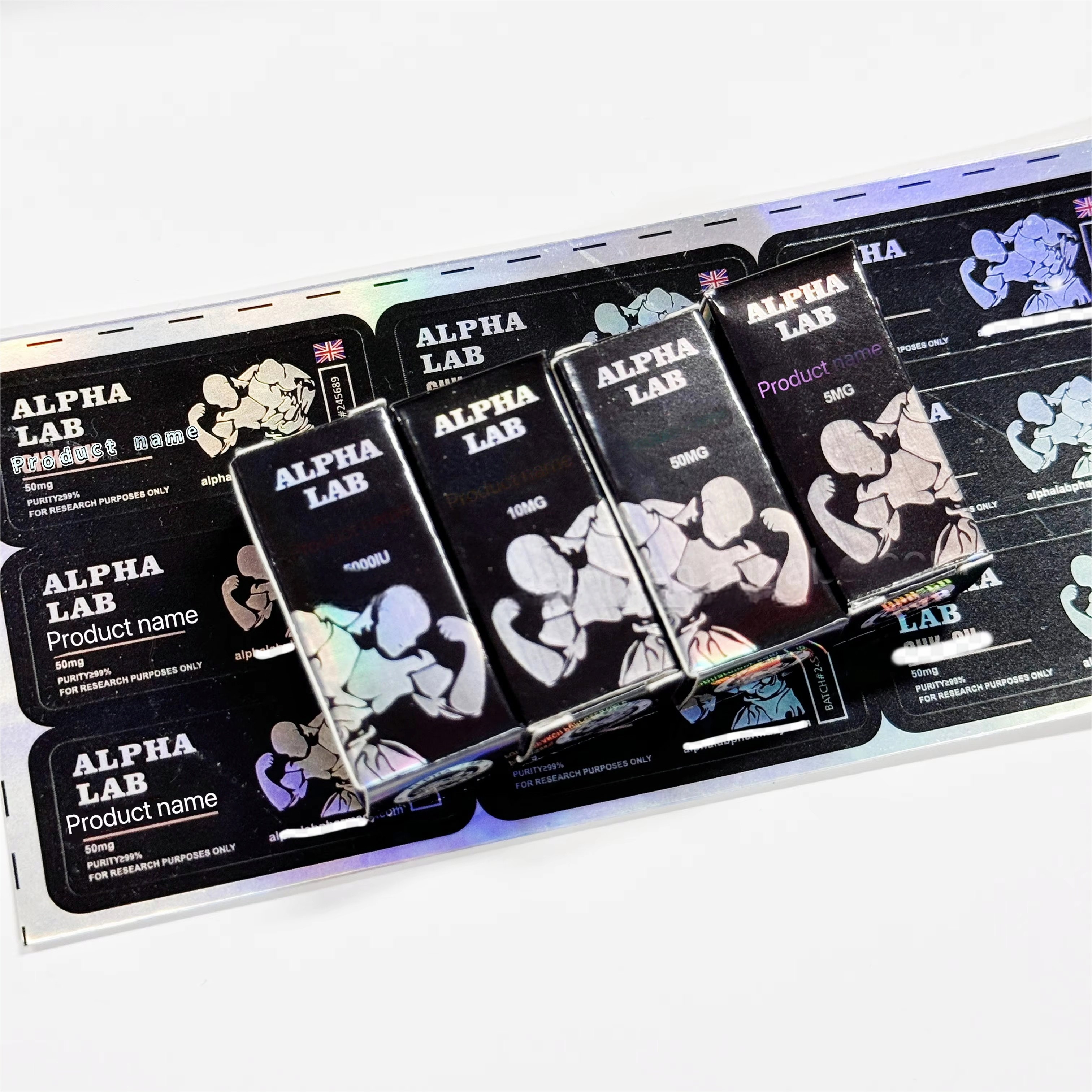
The design phase is the first and one of the most important steps in the printing process. During this phase, the layout for the medicine box is created. It involves determining where the text, logos, images, and other design elements will be placed on the box. The design must be both functional and visually appealing, ensuring that the packaging attracts consumers while also providing important information in a clear, easy-to-read format.
The design should include regulatory details such as dosage information, warnings, and active ingredients. Colors and fonts play a significant role in the design, influencing readability and the overall consumer perception of the product. In designing a medicine box, the aesthetic appeal and clarity of the printed text are paramount, as they directly impact consumer trust and ease of use.
Proofing
Once the design is completed, the next step is proofing. Proofing is the process of reviewing a sample print before going into full production. This stage ensures that all design elements, including colors, fonts, and images, are correctly represented. It also allows for any last-minute adjustments to be made.
The proofing process typically involves a physical or digital prototype of the medicine box, which is checked for any errors or discrepancies. It’s essential that this stage is thorough, as even minor mistakes in design can lead to regulatory non-compliance or a negative consumer experience.
Printing
After the proof is approved, the printing process begins. Printing involves transferring the final design onto the chosen material using advanced printing techniques such as offset or flexographic printing. The choice of printing technique depends on factors such as the material used for the medicine box and the quantity of boxes to be printed.
Printing quality is vital in this step. Clear, sharp text and images are necessary to ensure that the printed information on the medicine box is legible and accurate. Additionally, the ink must be durable enough to withstand handling and transportation without fading or smudging.
Lamination
Lamination is a finishing process that involves applying a thin layer of protective coating to the printed medicine box. This layer can be either matte or glossy, depending on the desired finish. The primary purpose of lamination is to enhance the durability of the box, protecting the print from wear and tear. It also adds a layer of protection against environmental factors like moisture and dirt.
Laminating the medicine box not only increases its lifespan but also improves its overall appearance. A glossy lamination can make the design stand out more vibrantly, while a matte lamination can provide a more sophisticated and understated look.
Die-cutting
Die-cutting is the process of cutting the printed material into the desired shape and size of the medicine box. This step ensures that the box will fit together perfectly during assembly. Die-cutting can also be used to create unique shapes, windows, or perforations that enhance the functionality and visual appeal of the packaging.
Accurate die-cutting is essential for the box to be assembled properly without any misalignments. It also plays a role in the aesthetic quality of the packaging, ensuring that edges are clean and precise. A well-done die-cutting job will ensure the box folds and assembles easily, enhancing the overall customer experience.
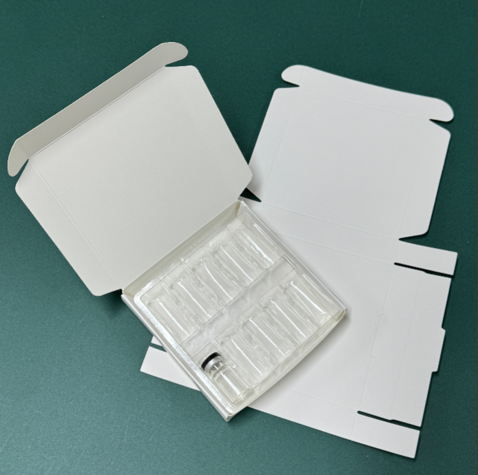
Gluing
The final stage in the printing process is gluing, which involves attaching the different parts of the medicine box together. The components of the printed material are glued into their final shape, ensuring the box is secure and able to hold the product safely during storage and transport.
The glue used in the assembly process must be strong enough to hold the box together but also quick-drying to prevent delays in the production process. It’s important to ensure that the glue does not interfere with the printed design or affect the structural integrity of the box.
Medicine Box Design Guidelines
Designing a medicine box requires more than just creativity—it must adhere to specific guidelines to ensure clarity, safety, and compliance with regulations. Here are some important design considerations:
Font and Color
The font and color choices on a medicine box play a vital role in ensuring that the packaging is not only visually appealing but also functional.
Font Specifications
Fonts on medicine boxes must be legible and easy to read, especially considering that consumers and healthcare professionals will rely on the information provided. A font that is too small or complicated may cause confusion and make it difficult to read critical details like dosage or ingredients. The font size should be large enough to be easily visible, and the text should be placed in a clear hierarchy to guide the reader's attention.
For most pharmaceutical packaging, sans-serif fonts such as Arial or Helvetica are preferred due to their clean, modern appearance and high readability. The font size for essential information such as warnings, dosage instructions, and ingredients should follow regulatory guidelines to ensure readability and compliance.
Color Restrictions
In addition to font choices, color plays a crucial role in the overall design of the medicine box. Colors must be chosen carefully to maintain clarity and avoid confusion. For example, certain colors may be reserved for specific types of medications, such as green for natural or herbal remedies, or red for products that require heightened caution.
Regulatory authorities, such as the FDA and EMA, may also impose restrictions on color usage to prevent misinterpretation of the packaging. For instance, colors like red or yellow may be used for warnings, while blue or green is typically associated with non-hazardous products. It’s crucial that the colors used on the box help convey the intended message without causing ambiguity.
Differences in Children’s Medicine/Prescription Drug Packaging
Packaging for children’s medicine often has a few distinct differences compared to prescription drugs. Children’s medicine packaging must prioritize safety and child-friendly design features. This includes ensuring that the packaging is tamper-evident and child-resistant, as well as using brighter, more engaging colors and designs to appeal to both children and their caregivers.
For prescription drugs, the packaging typically includes more formal, standardized designs that convey trust and reliability. The color scheme may be more subdued, and the design is focused on providing critical information clearly and professionally. Additionally, prescription drug packaging must comply with stricter regulations, especially when it comes to labeling and font size, to ensure that the user can clearly understand all of the medical instructions.
FAQ
What are the key elements of a medicine box design?
A medicine box design should include clear and legible fonts, appropriate color choices, and easy-to-understand packaging. It must also adhere to regulatory requirements, including the inclusion of essential product information such as dosage instructions, warnings, and ingredients.
Why is proofing important in the medicine box printing process?
Proofing is essential to catch any design errors or inconsistencies before mass production begins. It ensures that the final product accurately represents the design, complies with regulations, and avoids costly mistakes in production.
How do font size specifications affect medicine box designs?
Font size specifications are critical for ensuring that the text on the medicine box is legible, especially for vital information such as dosage, warnings, and ingredients. The font size must be large enough to meet regulatory standards while also fitting within the design’s layout.
What are the differences in packaging design between children’s medicine and prescription drugs?
Children’s medicine packaging often includes brighter colors and child-resistant features, while prescription drug packaging tends to have a more formal, standardized design. Both must comply with strict safety and regulatory guidelines, but the focus of each packaging design is slightly different based on the target audience.