
 EN
EN
Why is pharmaceutical packaging more important than FMCG packaging?
How does packaging reflect quality for high-value pharmaceutical products?
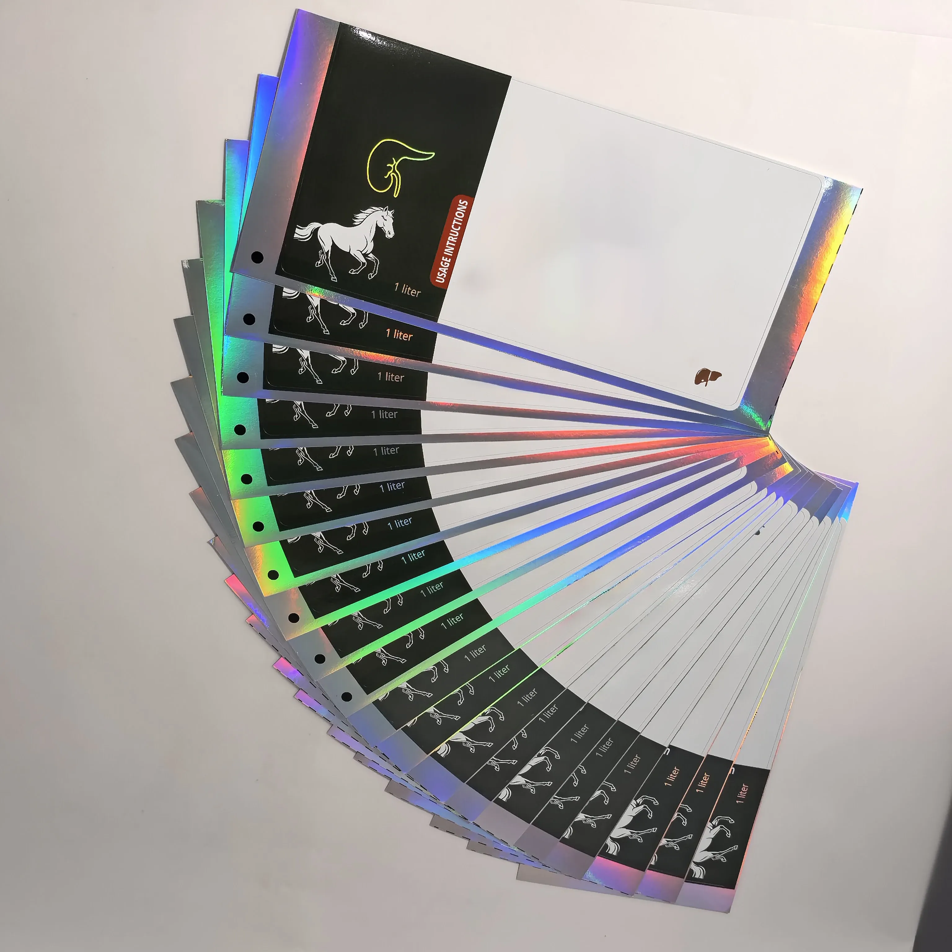
When a patient or healthcare provider holds a custom medical paper box, their subconscious evaluation of the brand begins. Is the print crisp? Does the holographic security seal look authentic? Is the branding consistent with previous doses? At the intersection of compliance and design, packaging becomes a powerful tool for building and maintaining brand trust.
1. Design Consistency Across Markets: The Anchor of Reliability
For global pharmaceutical brands, consistency is the visual language of safety. A patient who travels from one country to another and receives the same medication should find a package that feels familiar. Inconsistency in color, typography, or logo placement can inadvertently trigger fears of counterfeit products or sub-standard manufacturing.
Standardizing Visual Assets for Multi-Market Launches
Managing a global brand means ensuring that the "Medical Blue" on a 10ml vial label in Asia is identical to the one in Europe.
Global Style Guides: Brands must implement rigid design protocols for all custom-printed medicine boxes. This ensures that even when local regulatory text changes, the core brand elements—logo position, primary colors, and iconography—remain anchored.
Centralized Production Standards: By working with specialized printers who understand international standards, brands can ensure that their self-adhesive labels maintain visual parity across thousands of miles. This predictability reinforces the patient's trust in the product’s origin.
Navigating Regulatory Variations Without Losing Identity
Each market has its own requirements for warning labels, font sizes, and batch tracking. The challenge is to accommodate these rules without fracturing the brand's visual identity.
Modular Layout Strategy: Utilizing a modular design for paper boxes allows for a fixed "branding zone" and a flexible "regulatory zone." This keeps the brand recognizable while ensuring 100% compliance with local health authorities.
Bilingual and Multilingual Integration: For markets with multiple official languages, using a clean, organized layout for vial instructions prevents the package from looking cluttered. A cluttered package often looks "cheap" or "unprofessional," which can erode trust.
The Role of Consistency in Counterfeit Deterrence
Consistency isn't just about aesthetics; it’s a security feature. Patients who are intimately familiar with a brand's packaging are the first to notice when something is "off."
Precision Printing as a Barrier: High-resolution printing on peptide labels ensures that fine lines and micro-text are perfectly sharp. Counterfeiters often struggle with these details. When a brand consistently delivers this level of precision, any deviation becomes a red flag, thereby protecting the patient and the brand’s integrity.
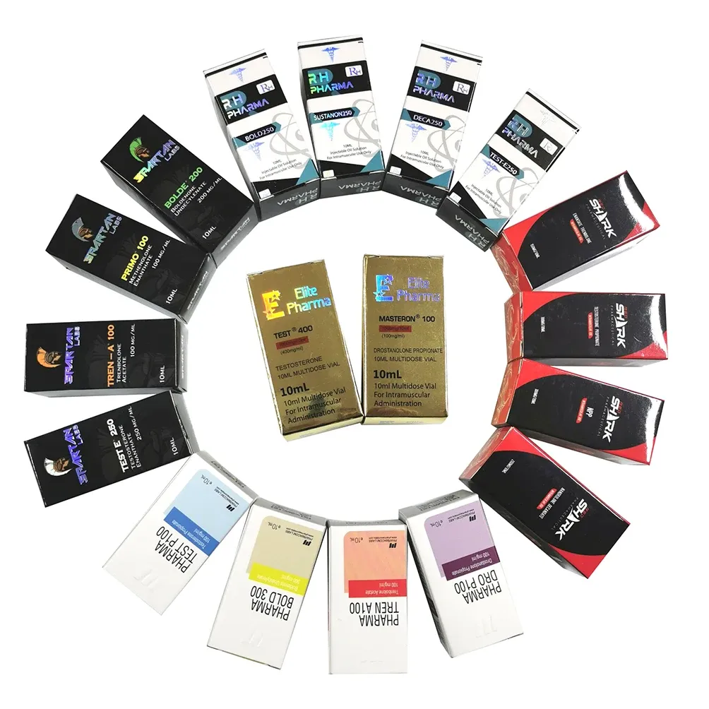
2. Premium Finishes Within Regulatory Limits: Communicating Quality
In the pharmaceutical world, "Premium" does not mean "Flashy." Instead, a premium finish communicates stability, cleanliness, and investment in the product. Utilizing high-end printing techniques within the boundaries of medical regulations can elevate a brand from a generic commodity to a trusted healthcare partner.
Utilizing Specialty Coatings for Functional Elegance
The tactile feel of a package can communicate care.
Matte Lamination and Soft-Touch Finishes: Applying a matte finish to a custom paper box provides a sophisticated, non-reflective surface that is easier to handle. It suggests a higher level of manufacturing care compared to the "glossy and flimsy" boxes often associated with low-cost, unregulated markets.
Aqueous and UV Coatings: These coatings protect the vial box from moisture and abrasions during shipping. A package that arrives in pristine condition—without scuffs or tears—signals that the brand respects the medicine it contains.
Security Features as a "Premium" Trust Signal
Security and premium branding are often the same thing in pharma.
Holographic Anti-Counterfeit Stickers: A hologram sticker on a vial cap or box seal does double duty. It provides a technical barrier to faking, but it also acts as a visual "seal of approval." The shimmering effect of a high-quality hologram is a universal symbol of authenticity that patients recognize and trust.
Spot UV and Embossing: Using Spot UV to highlight a brand logo or embossing the dosage on a 10ml vial box adds a professional, high-end feel. These small investments in finish tell the patient: "If we care this much about the box, imagine how much we care about the medicine inside."
Balancing Aesthetics with Sterile Requirements
In sterile environments, the packaging must not only look good but also perform.
Medical-Grade Substrates: Using high-whiteness, low-dusting paperboards for sterile vial trays ensures the product looks "medical" rather than "commercial." Trust is built when the packaging reflects the sterile, clinical nature of the laboratory where the drug was created.
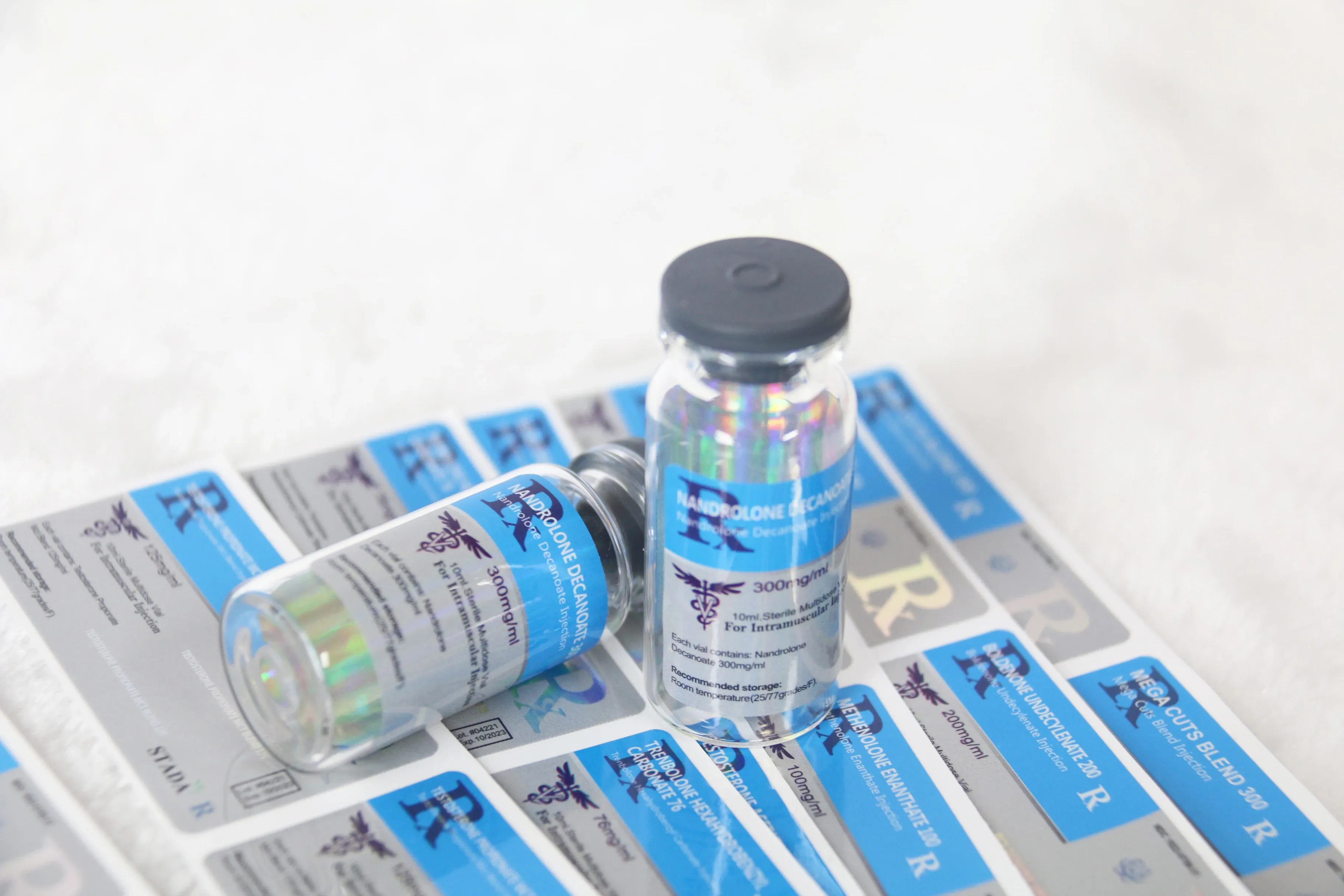
3. Storytelling Through Packaging: Humanizing the Science
Pharmaceutical brands often struggle to connect with patients because the science can feel cold and distant. Storytelling through packaging is the process of using the limited space available to communicate the brand’s values, heritage, and commitment to the patient’s well-being.
Establishing a Connection Through Information Transparency
Trust is built on transparency. A package that makes information easy to find tells a story of honesty.
Interactive QR Codes: By placing a QR code on the waterproof vial label, the brand invites the patient into its world. A scan can lead to a video about the brand’s history, its sustainable sourcing practices, or a message from its lead scientists. This "digital storytelling" expands the relationship beyond the physical box.
Clear "Why" Statements: Even a small line of text on a peptide carton—such as "Engineered for Precision Performance"—gives the brand a voice and a purpose.
Visual Metaphors and Brand Symbolism
The choice of colors and icons can tell a story of healing, energy, or peace.
The Psychology of Color: A brand focused on life-extension and vitality might use vibrant greens and whites, while a brand focused on calming therapeutic treatments might use deep teals and soft grays. Consistent use of these colors across vial labels and boxes tells a coherent story of what the brand stands for.
Standardized Symbols of Care: Using intuitive, friendly icons for dosage instructions—rather than just clinical text—humanizes the brand. It shows that the company understands the patient’s journey and is trying to make it easier.
Packaging as an Unboxing "Experience"
In the specialized world of high-end peptides and steroids, the "unboxing" matters.
Integrated Tray Systems: When a patient opens a custom-designed box and finds the 10ml vials securely nestled in a custom-fitted tray with perfectly aligned labels, it creates an experience of "Professional Excellence."
The "First Impression" Strategy: This level of organization tells a story of a brand that is organized, meticulous, and focused on every detail. This initial positive impression is the bedrock of long-term brand loyalty.
Conclusion: The Package is the Promise
Building brand trust in the pharmaceutical industry is a long-term investment. It is not achieved through a single marketing campaign, but through the cumulative effect of every interaction the patient has with the product.
From the design consistency of a vial label across three continents to the premium matte finish of a medical carton, and the digital storytelling enabled by a QR code—every detail matters. At its core, packaging is a promise. It is a promise of safety, a promise of quality, and a promise that the brand cares about the person holding the box. By prioritizing these elements, pharmaceutical companies can transform their packaging from a logistical necessity into their most powerful brand ambassador.
Want to learn about the future of smart, sustainable, and user-friendly packaging? Check out our latest article for the full scoop!