Why is pharmaceutical packaging design so crucial in high-precision manufacturing?
How does packaging design support safety for high-potency medications?
This article explores the critical design strategies that transform pharmaceutical packaging into a reliable tool for patient safety.
1. Visual Cues for Dosage Clarity: The Power of Instant Recognition
Human error often occurs due to "confirmation bias"—a nurse or patient expects to see a certain dosage and "sees" it even if it’s wrong. Visual cues, primarily through color and contrast, are designed to break this bias and force accurate recognition.
Implementing a Color-Coding Hierarchy
Color is the most immediate information a human brain processes. On vial labels and boxes, color should never be used randomly; it must follow a systematic logic.
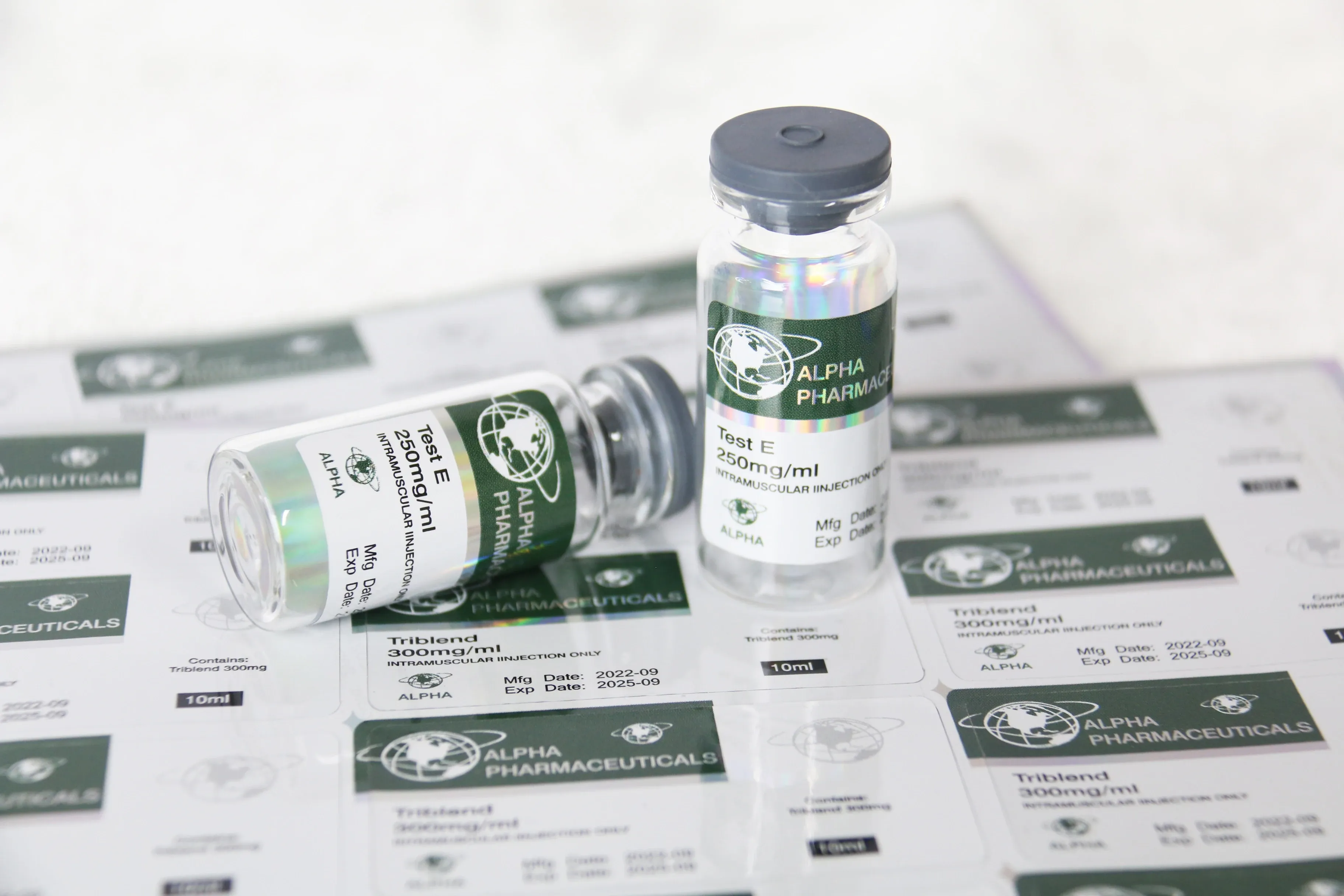
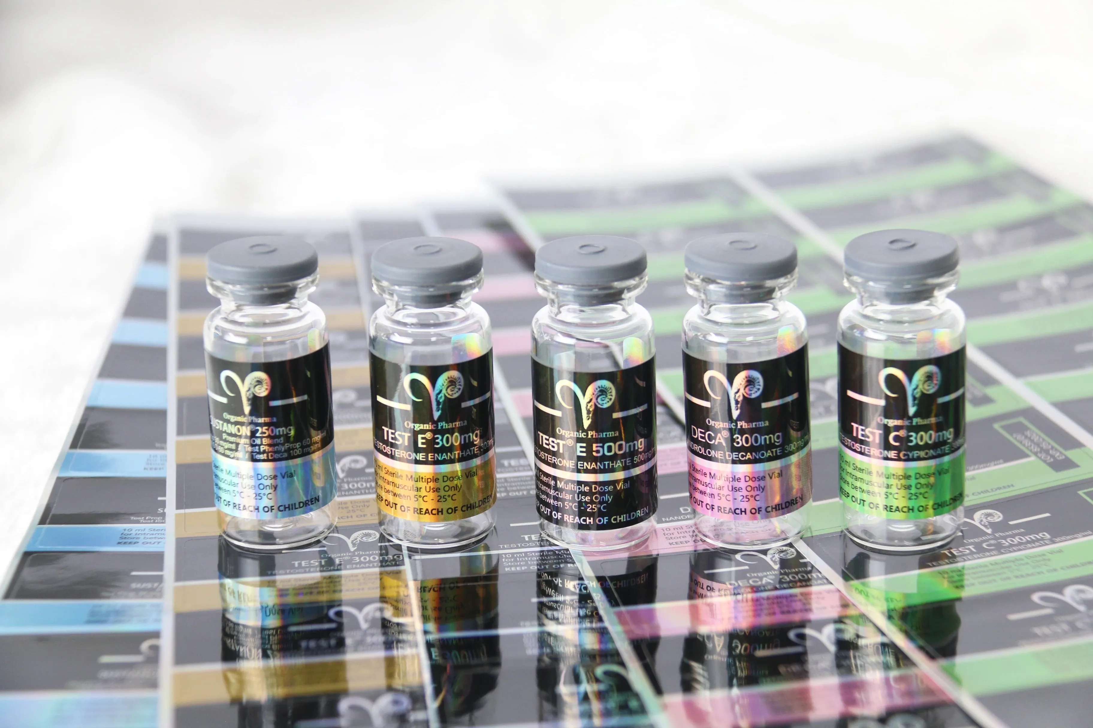
Differentiating Strengths: For a single product line with multiple concentrations (e.g., 5mg, 10mg, and 20mg), each strength should be assigned a distinct, high-contrast color. A bright red band for the highest dose and a soft blue for the lowest allows for instant differentiation in a crowded medicine cabinet.
Consistency Across SKU Lines: If a brand produces various peptides or steroids, maintaining a consistent color language across the entire product family helps users build a mental map of their treatment, reducing the "search-and-find" time that leads to errors.
High-Contrast Backgrounds for Critical Data
Pharmaceutical environments often involve low-light conditions or the use of translucent containers.
Opacity and Legibility: When printing on clear 10ml vials, using a white "hit" (a solid white background layer) under the text area of a transparent label is essential. This ensures that the dark liquid inside the vial does not obscure the black text of the dosage instructions.
Gloss vs. Matte Finishes: As highlighted in modern printing standards, a matte lamination is superior for safety. It eliminates the glare from overhead fluorescent hospital lights, ensuring that the dosage numbers are readable from any angle without the user needing to rotate the vial to avoid "hot spots" of reflection.
Tactile Cues and Special Finishes
Beyond sight, the sense of touch can provide a secondary safety check.
Embossing and Spot UV: By applying a raised Spot UV finish or embossing to the dosage number on a custom paper box, manufacturers provide a tactile cue. This is particularly helpful for elderly patients or those with visual impairments, allowing them to "feel" the strength of the medication.
2. Standardized Icons and Symbols: A Universal Language of Safety
In a globalized market, medication often crosses linguistic borders. While text is subject to translation errors, standardized icons and symbols provide a universal language that is understood instantly, regardless of the user's native tongue.
Utilizing ISO and Regulatory Symbols
The use of internationally recognized symbols is a cornerstone of safe packaging layout.
Storage and Handling Icons: Symbols for "Store in Refrigerator" (snowflake), "Protect from Light" (sun with a roof), and "Single Use Only" (slashed number 2) must be prominently placed on the secondary paper box. These icons act as immediate warnings that prevent product degradation due to improper storage.
Warning Triangles and Pictograms: For high-potency or hazardous substances, a standardized warning triangle or a specific pictogram for "Not for Oral Use" (an intravenous bag icon) provides a critical safety barrier that text alone cannot achieve.
Simplifying Instructions with Pictorial Layouts
Complex medical procedures—such as reconstituting a powder in a sterile vial—are prone to user error if the instructions are only available in a dense block of text.
Step-by-Step Infographics: Integrating 3 or 4 simple icons on the side panel of a custom-printed box can guide the user through the process of "Snap, Mix, Draw, and Inject."
Directional Arrows: For vial flip-off caps or easy-open paper boxes, printing small directional arrows indicating the "pull" or "twist" motion ensures that the sterile seal is opened correctly without compromising the integrity of the stopper.
QR Codes as Gateways to Visual Safety
As part of an interactive labeling strategy, a scannable QR code on the waterproof sticker can lead the user to a digital library of symbols and video-based safety guides. This "Digital Twin" of the physical packaging ensures that if the user is confused by a symbol, a simple scan provides an instant, animated explanation.
3. Reducing User Errors: Information Architecture and Layout
The "Layout" of a label refers to the information architecture—how the data is prioritized and organized. A cluttered label is a dangerous label.
The Rule of Proximity and Grouping
Information that is related should be grouped together to prevent the eye from jumping across the label and missing a key detail.
The "Safety Zone": On a 10ml vial label, the drug name and dosage should occupy a dedicated "Safety Zone" free from distracting logos or decorative elements.
Separating Expiration and Batch Data: While batch numbers and expiration dates are vital for traceability, they should be separated from the dosing instructions to prevent numerical confusion. Using a different font weight or a boxed-in area for "EXP" and "LOT" data helps the user distinguish between "How much to take" and "Is it still safe to take."
Typography for Extreme Legibility
Not all fonts are created equal when it comes to medical safety.
Sans-Serif Superiority: Fonts like Helvetica or Arial are preferred because they lack the "tails" (serifs) that can blur together at small sizes. When printing on the limited surface of a vial label, every micron of clarity counts.
Avoiding Ambiguous Characters: A "1" should never look like an "I," and a "0" should never look like an "O." Professional medical printers select typefaces specifically designed to prevent character confusion, which is the leading cause of decimal-point errors in medication administration.
"Tall-Man" Lettering: For look-alike, sound-alike (LASA) medications, using Tall-Man Lettering (e.g., buPROPion vs. busPIRone) on the paper box and label draws immediate attention to the differences in the names, preventing a fatal "pick-error" in the pharmacy.
Utilizing White Space (Negative Space)
The most underrated tool in safety design is "nothing."
Breaking Up Information: By intentionally leaving white space between the drug name and the legal manufacturer info, the designer creates "breathing room" for the eye. This reduces cognitive load, allowing the brain to process the most important information first without being overwhelmed by the 1,000-word legal disclaimer printed on the back of the medical carton.
Conclusion: Engineering Trust Through Design
Designing for pharmaceutical safety is about removing obstacles. Every choice—from the specific shade of a color-coded band on a vial to the "Tall-Man" typography on a custom paper box—is an opportunity to prevent an error.
At the intersection of high-quality printing and rigorous safety standards, the packaging becomes more than just a box; it becomes a silent guardian for the patient. By prioritizing clarity, universality, and logical architecture, manufacturers can ensure that their life-saving products are delivered with the same level of precision with which they were formulated.
Clear communication through design is the ultimate commitment to "Patient First" healthcare.
Want to learn about the future of smart, sustainable, and user-friendly packaging? Check out our latest article for the full scoop!